Some things I’ve worked on for friends and coworkers. Most are pretty clean and basic with subtle ways they stand out to make them iconic. The most important idea I focus on is immediate recognizability relative to any competitors. I use bright colors and/or abstract designs frequently.
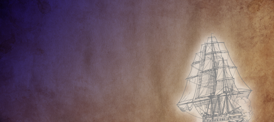
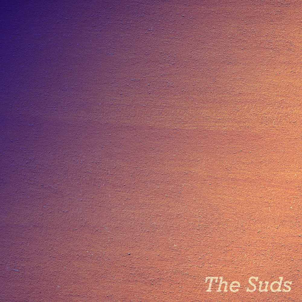
Catalyst Investors Quarterly Newsletter Header (2018)Pixelpine Logo (2016)Matt and the B Flats main logo (2017)Short Film Series character (2017)Rejected album art… I liked it though. (2017)College of Staten Island’s Department of Media Culture (2017)


You must be logged in to post a comment.